




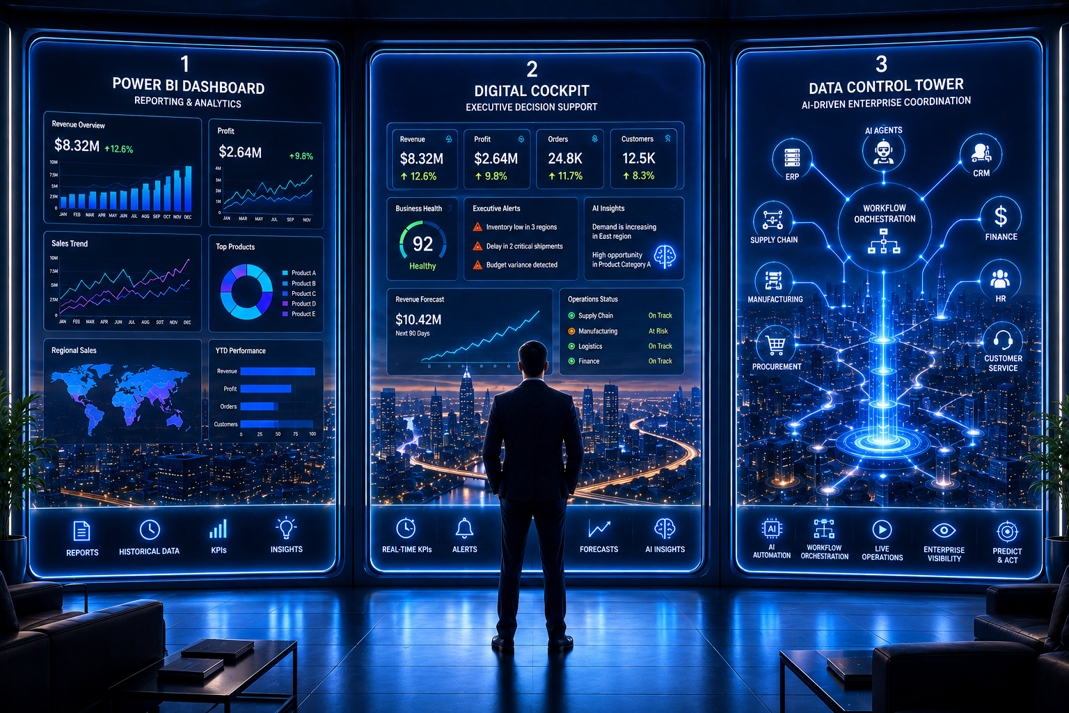
Ask three stakeholders inside the same enterprise what a “control tower” is and you will likely get three different answers – one describing a Power BI dashboard, one describing a curated executive view, one describing a full cross-functional operational nerve centre. All three terms circulate together in enterprise conversations about real-time visibility, and they are routinely used as if they mean the same thing.
They don’t. Each describes a genuinely different layer of enterprise reporting capability, with a different scope, audience, and technical requirement. This post draws a precise line between the three, and sets out how they typically fit together in a coherent visibility architecture.
Defining the Terms
What Is a Power BI Dashboard?
A Power BI dashboard is a visualisation built on the Power BI platform – charts, tables, and KPI tiles that present data in a consumable format. Power BI is a tool: it can render a simple monthly sales summary or, with the right data integration and design underneath it, serve as the front end for a genuine control tower or digital cockpit. The dashboard itself does not define the sophistication of what it displays – the data and logic behind it do.
What Is a Data Control Tower?
A data control tower is a broad, cross-functional, typically operations-facing capability that integrates real-time or near-real-time data from multiple source systems – ERP, logistics, manufacturing, CRM – specifically to detect and support rapid response to operational exceptions. It is defined by its scope of integration and its exception-detection design, not by which visualisation tool renders it.
What Is a Digital Cockpit?
A digital cockpit is a narrow, curated, typically executive-facing view of the small number of metrics most critical to a specific decision-maker’s role – designed for fast comprehension and confident decisions, not comprehensive operational detail. A cockpit is often built on top of the same underlying data as a control tower, but presents a deliberately reduced, role-specific subset of it.
Why Enterprises Confuse the Three
The confusion happens because all three are commonly delivered through the same visualisation platform, and vendors market Power BI implementations broadly as “control towers” regardless of whether genuine real-time integration and exception logic sit underneath. A well-designed Power BI report and a genuine control tower can look similar on screen while representing entirely different levels of underlying engineering investment.
The practical consequence is enterprises that commission a “control tower” and receive a well-designed Power BI dashboard – accurate, attractive, but refreshing daily rather than in real time, and with no exception-alerting or cross-system integration behind it.
Side-by-Side Comparison
| Dimension | Power BI Dashboard | Data Control Tower | Digital Cockpit |
|---|---|---|---|
| Primary objective | Visualise data clearly | Cross-functional real-time visibility & exception response | Curated executive decision support |
| Typical audience | Broad, self-service business users | Operational & cross-functional teams | Executives & senior decision-makers |
| Data refresh cadence | Scheduled, often daily | Real-time or near-real-time | Real-time or near-real-time |
| Scope of integration | Single or few sources | Multiple systems, unified | Draws on control tower’s unified data |
| Alerting capability | Limited or none | Exception-based, threshold-driven | Curated critical alerts only |
| Typical outcome | Consistent visual reporting | Faster operational response to disruption | Faster, confident executive decisions |
The table illustrates the layered relationship: Power BI is the rendering tool, a control tower is the broad operational capability built using real-time integration and exception logic, and a digital cockpit is the curated executive layer drawing on that same underlying capability. They are not competing choices – they are different layers of the same visibility architecture.
How the Three Fit Together
You need a Power BI dashboard (on its own) when:
- Your requirement is consistent, self-service visualisation of already-trusted business data.
- Refresh cadence of hours or a day is genuinely sufficient for the decisions it supports.
- No cross-system, real-time integration or exception alerting is required.
You need a data control tower when:
- Operational teams need a unified, real-time view across multiple previously siloed systems.
- Exceptions need to be detected and routed automatically, not discovered through manual review.
- The cost of delayed visibility in this domain is high enough to justify real-time integration investment.
You need a digital cockpit when:
- A specific executive or senior leader needs a curated, always-current view of the handful of metrics that matter most to their decisions.
- The underlying real-time data already exists – typically from a control tower – and needs a role-specific, simplified presentation layer on top.
The Roadmap: Building All Three Coherently
Phase 1: Establish the Real-Time Data Foundation (2-4 months)
Build the unified, real-time integration layer across priority source systems – this is the genuine engineering work underlying a control tower, regardless of which visualisation tool ultimately renders it.
Phase 2: Build the Operational Control Tower (2-3 months)
Layer exception detection, alerting, and operational drill-down views on top of the real-time data foundation, designed around the specific teams and processes that will respond to alerts.
Phase 3: Build Role-Specific Digital Cockpits (4-8 weeks per role)
Using the same underlying real-time data, design curated cockpit views for specific executive or senior leadership roles – a deliberately reduced view, not a smaller version of the full control tower.
Phase 4: Continuous Refinement (ongoing)
Refine alert thresholds, cockpit metrics, and integration coverage as operational priorities and available data sources evolve.
Common Pitfalls
- Commissioning a Power BI dashboard and calling it a control tower – paying for genuine real-time integration and exception logic in name only, while receiving a well-designed but conventionally-refreshed report.
- Building a cockpit before the control tower’s data foundation exists – designing an executive view around data that isn’t yet genuinely real-time or integrated, producing a curated but unreliable summary.
- Treating all three as the same investment – failing to distinguish the different engineering effort and cost profile of each, leading to unrealistic timeline and budget expectations.
The Bottom Line
Power BI dashboards, data control towers, and digital cockpits are not three names for the same thing – they are different layers of an enterprise visibility architecture, each with a distinct scope, audience, and engineering requirement. Power BI is commonly the tool that renders all three, but the visualisation layer is the least differentiating part of the investment.
The right starting point is clarity on which of the three your organisation genuinely needs – and an honest assessment of the real-time data foundation required to deliver it credibly.
Related Services
- Power BI / Data Control Tower / Digital Cockpit
- Data Engineering & BI Services
- Data Analytics
- Digital Transformation
Need real-time operational visibility across your enterprise? Contact SMI TechSolutions to discuss how the right combination of Power BI, Data Control Towers, and Digital Cockpits can help your business make faster, data-driven decisions.